PROJECT
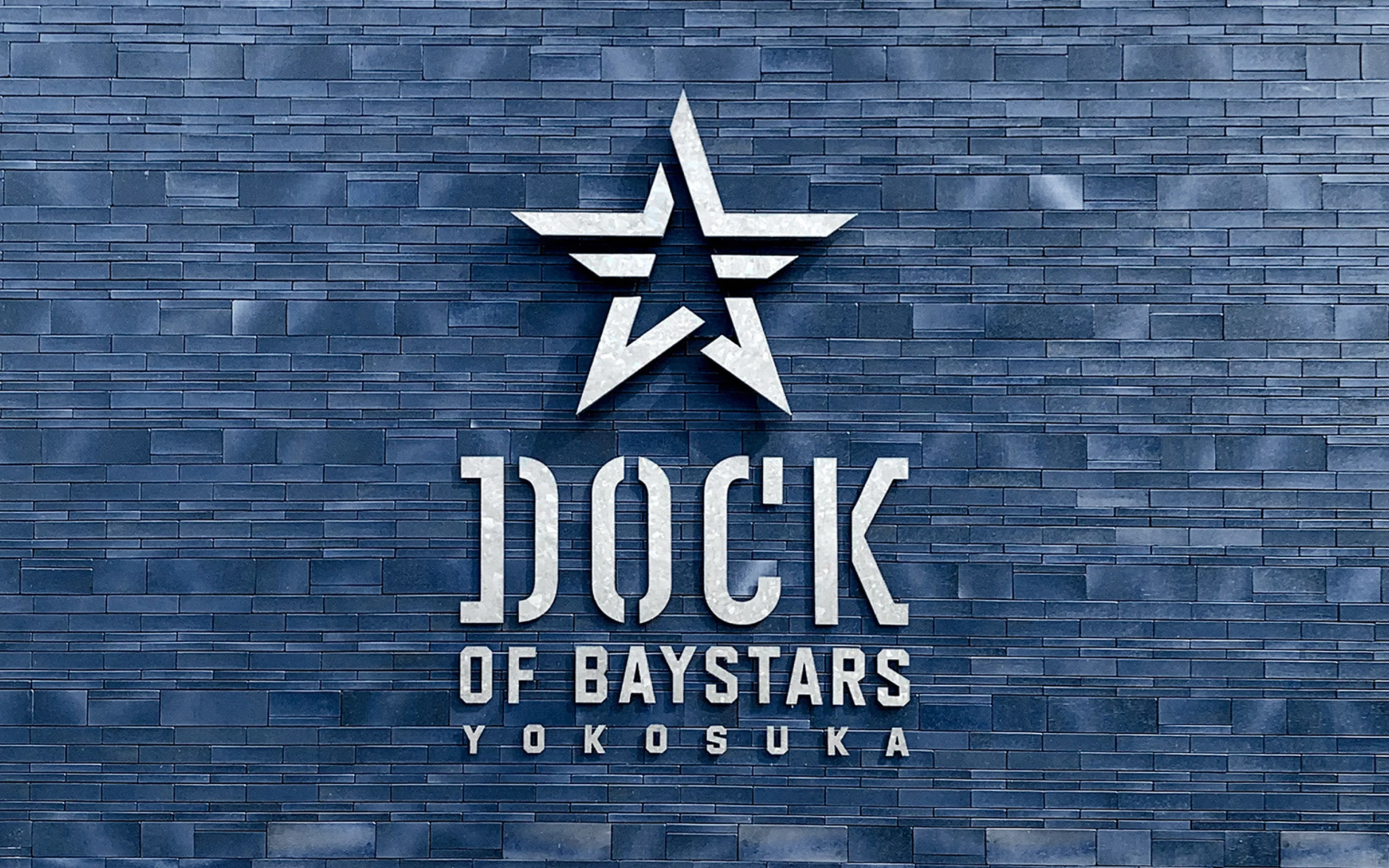
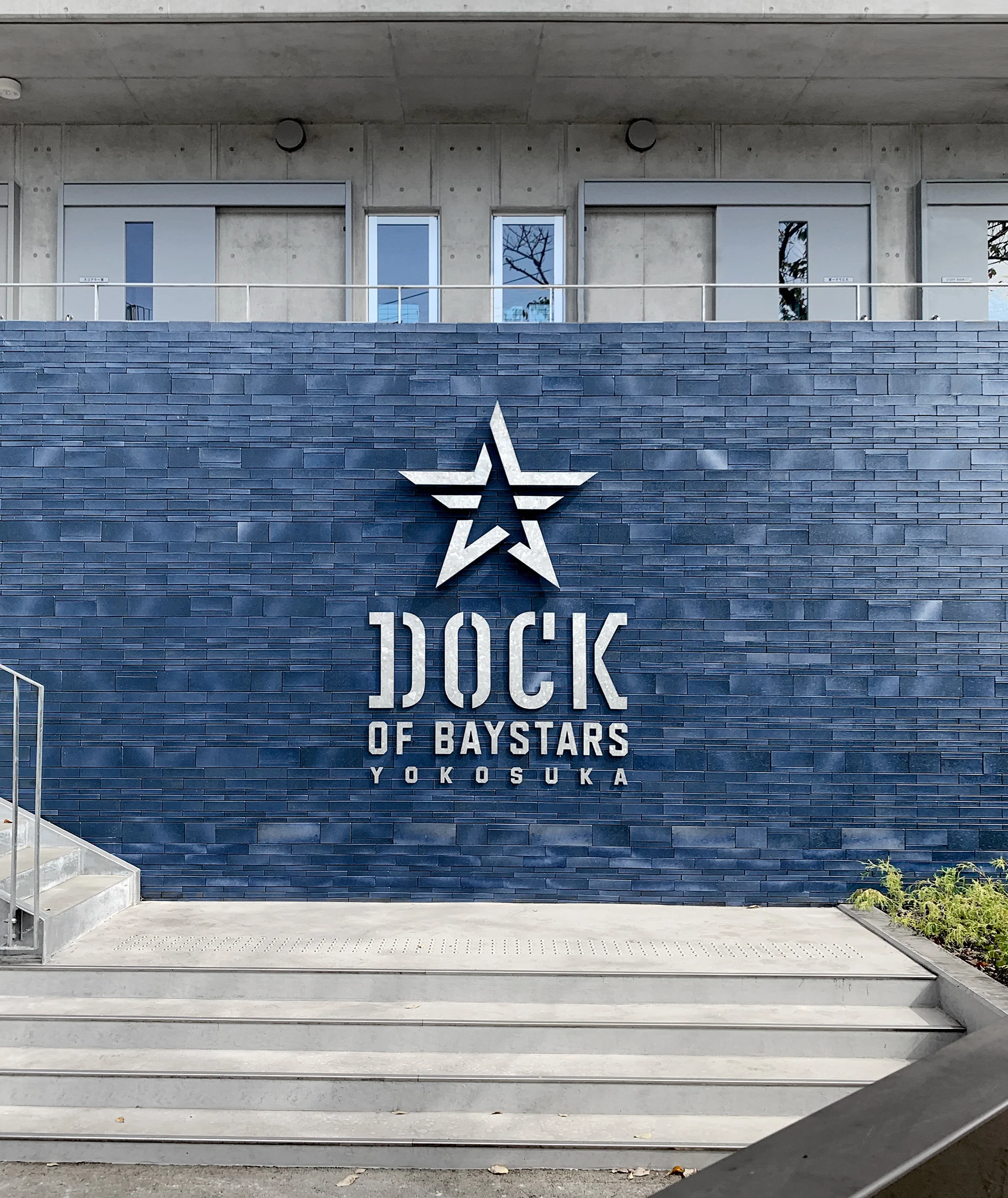
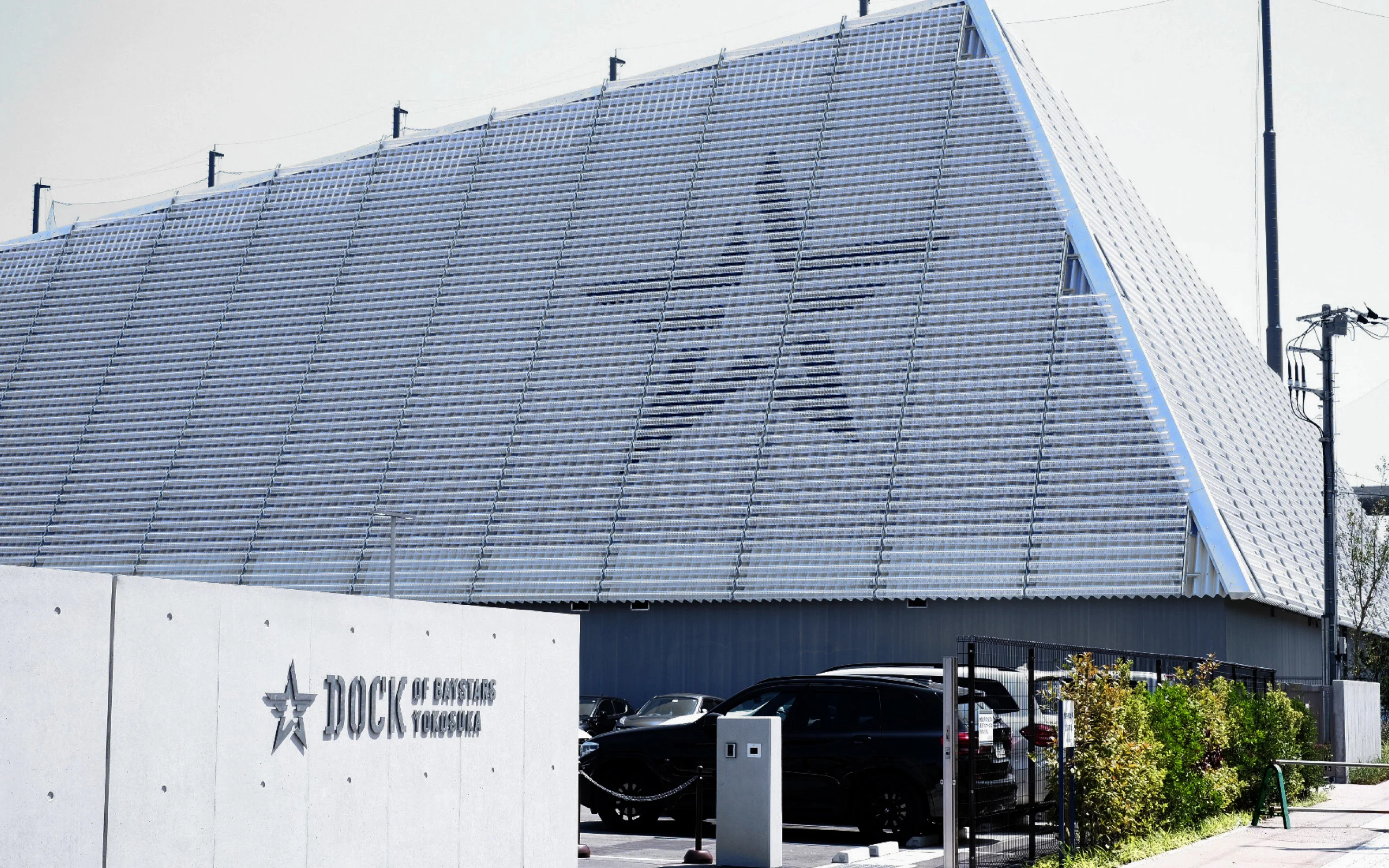
DOCK OF BAYSTARS YOKOSUKA
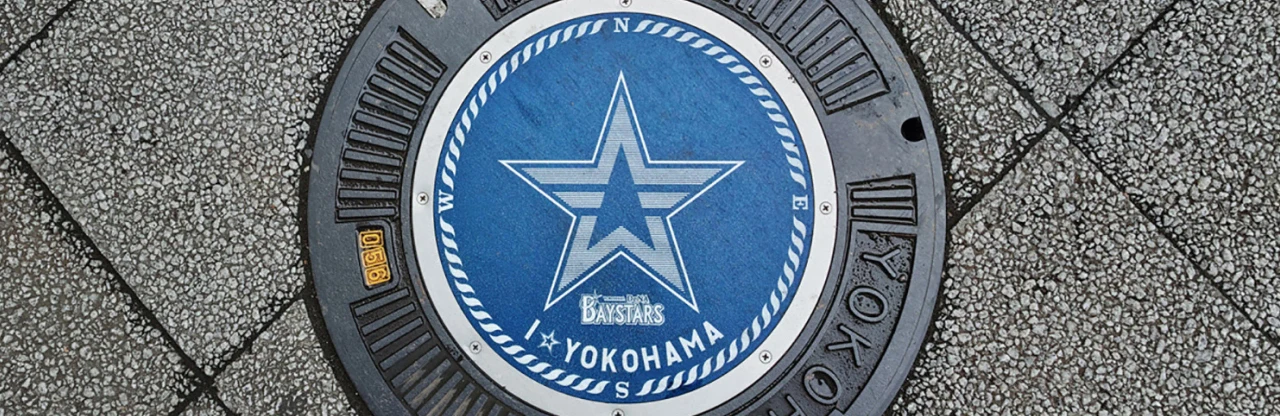
Team's signature star symbol enhanced with local Yokosuka identity integrated throughout the facility.
HOW
Branding a baseball team that embodies Yokosuka.
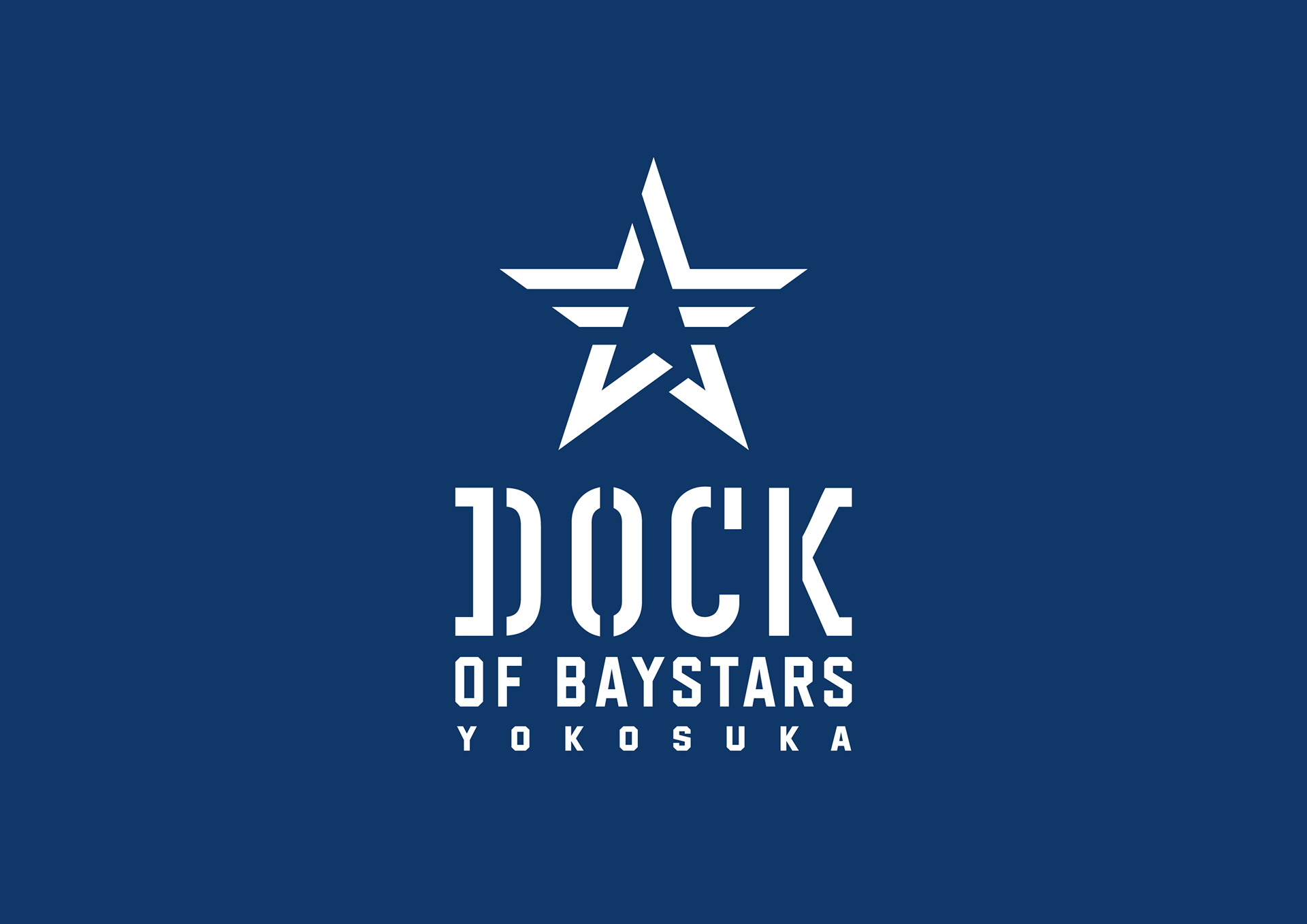
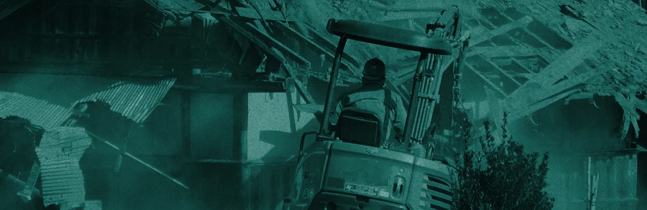
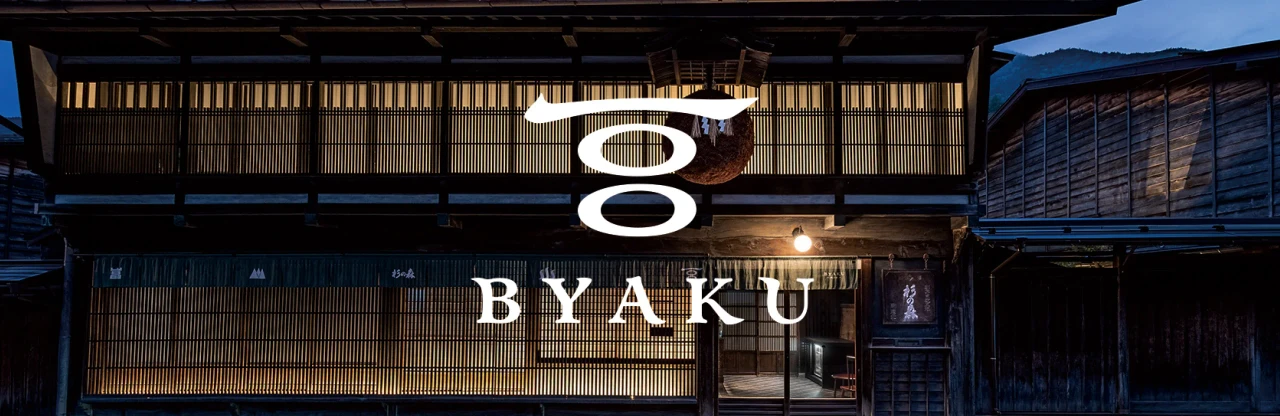
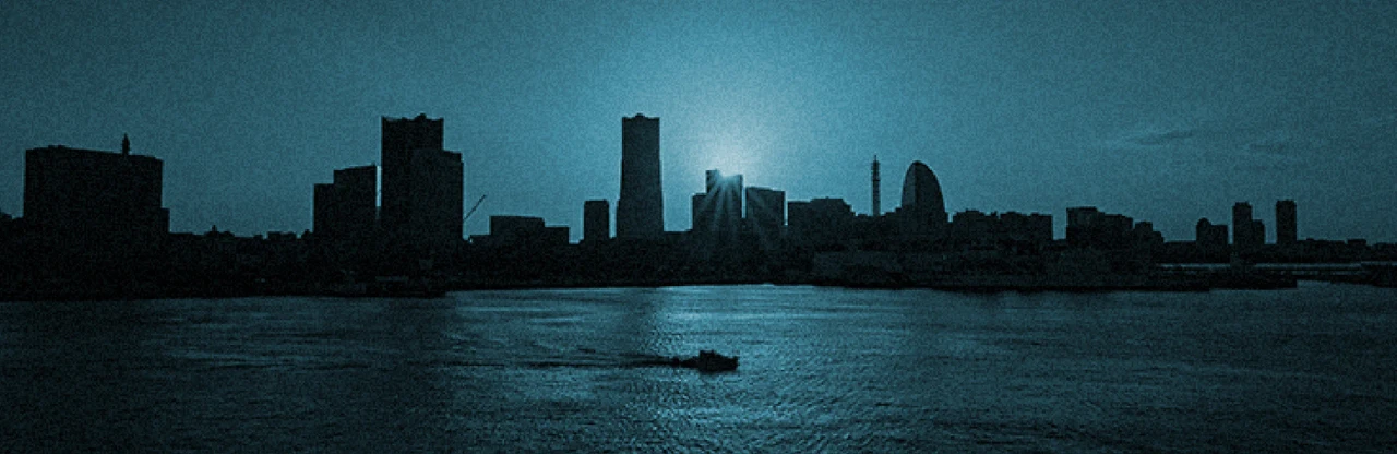
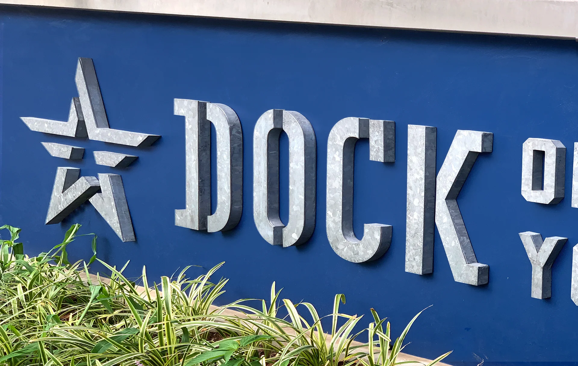
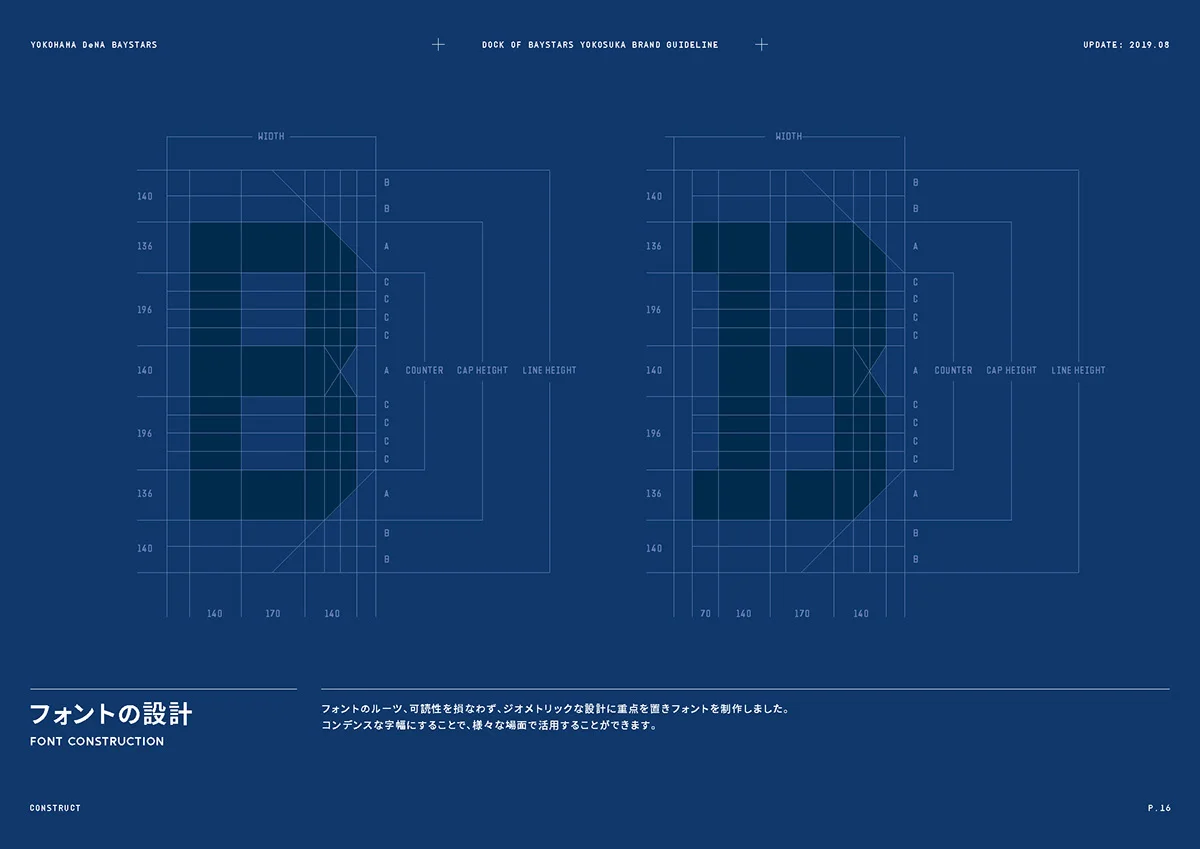
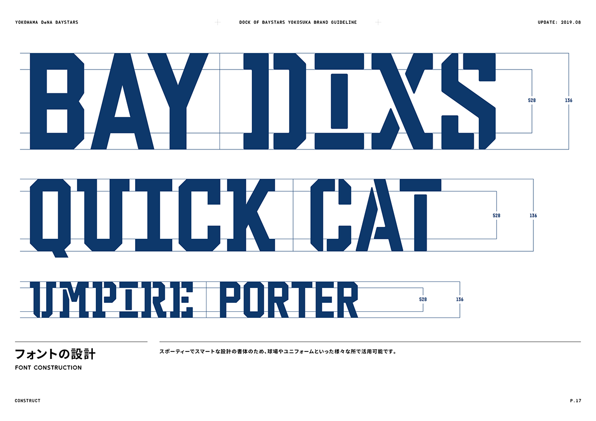
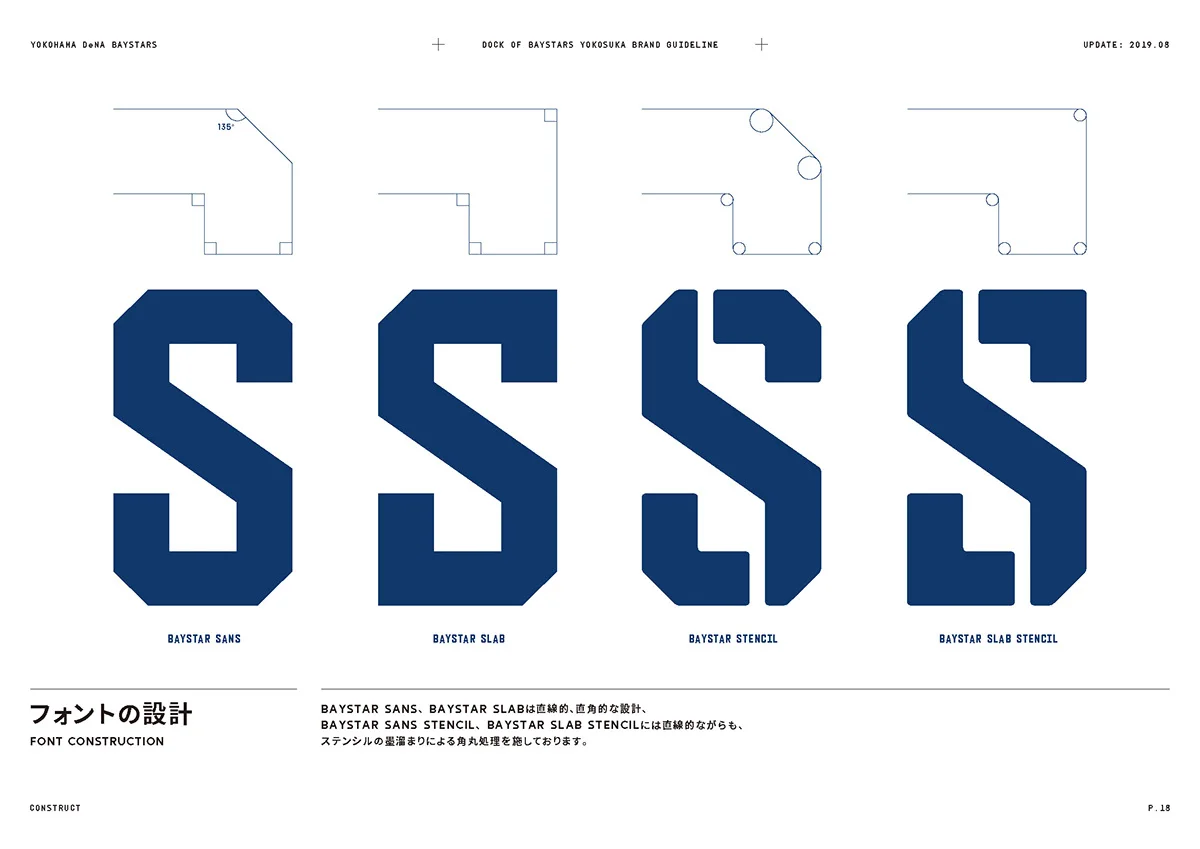
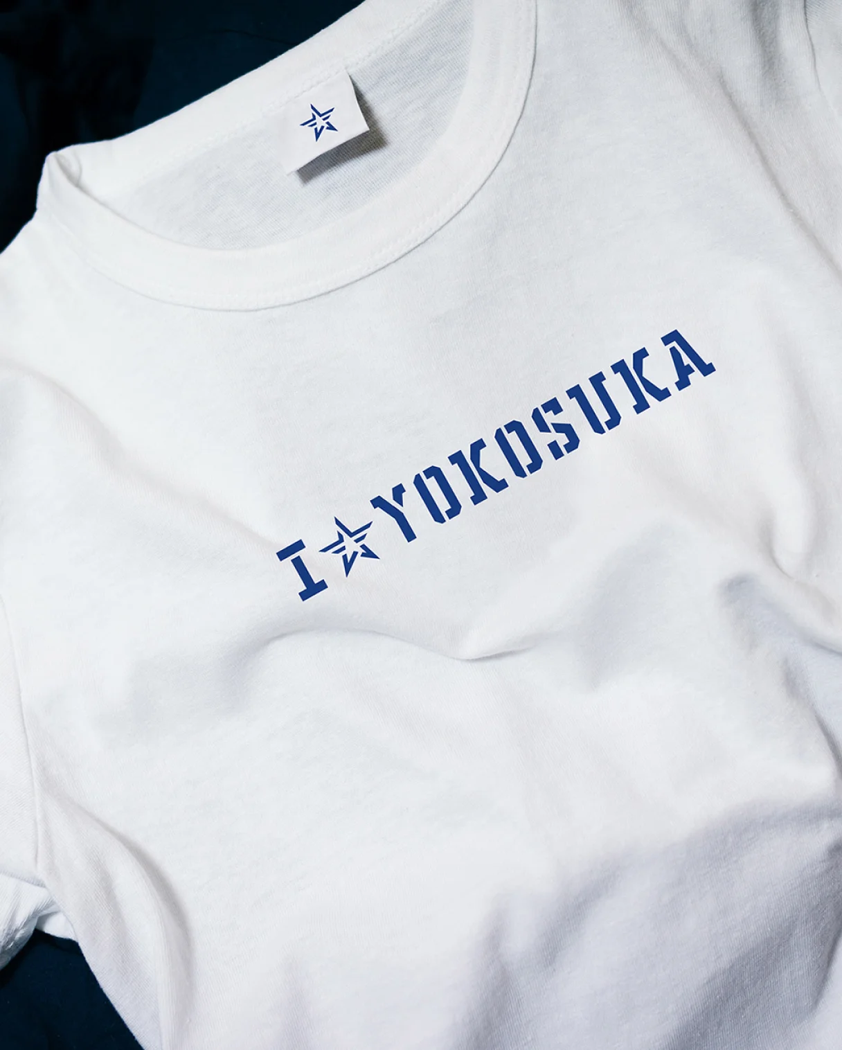
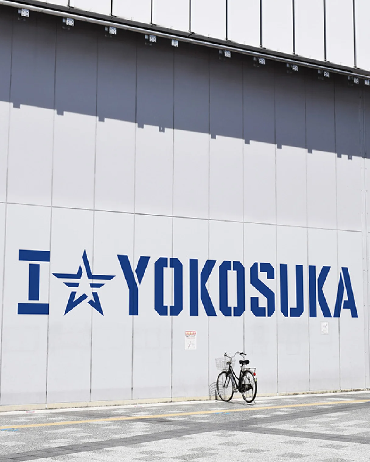
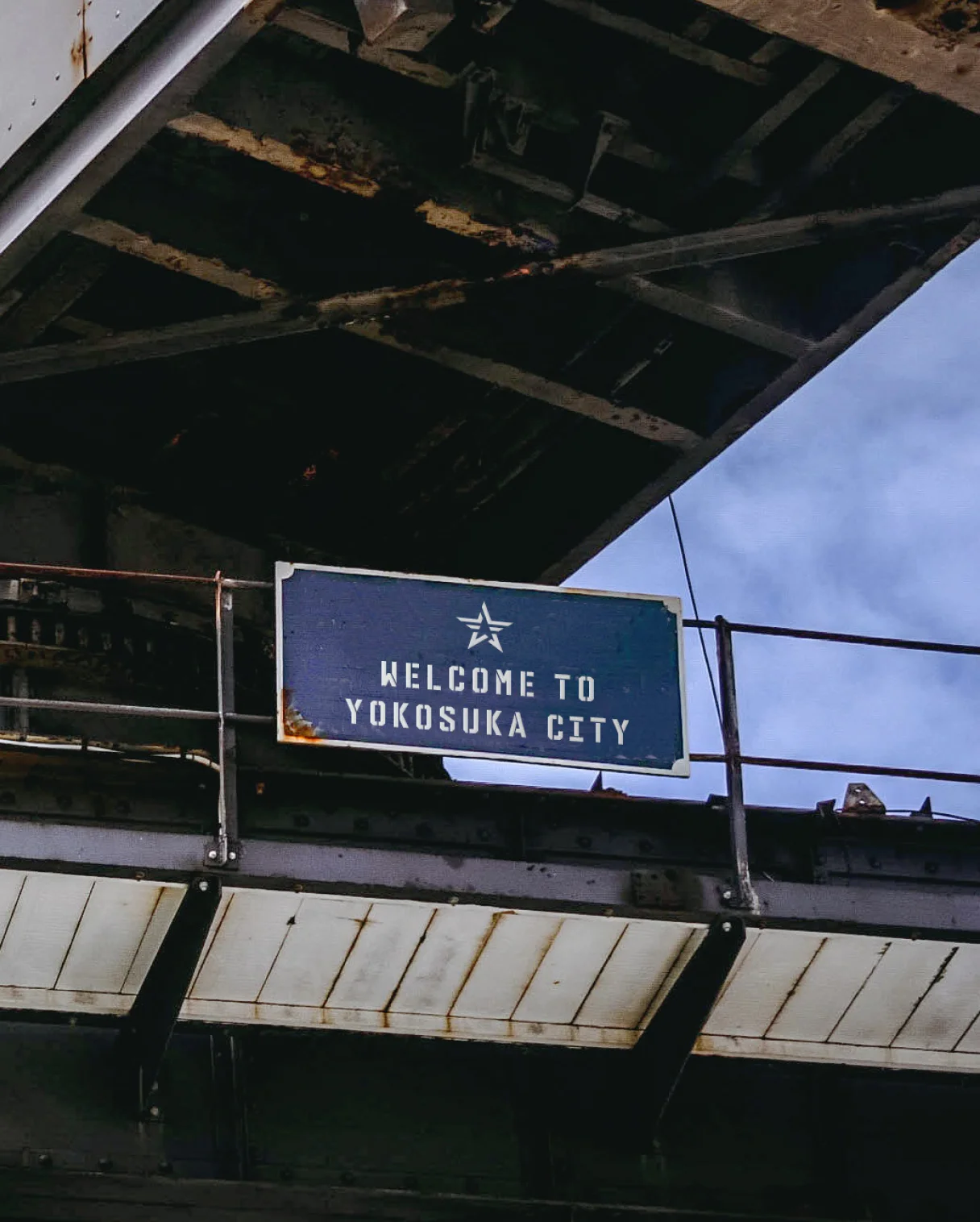
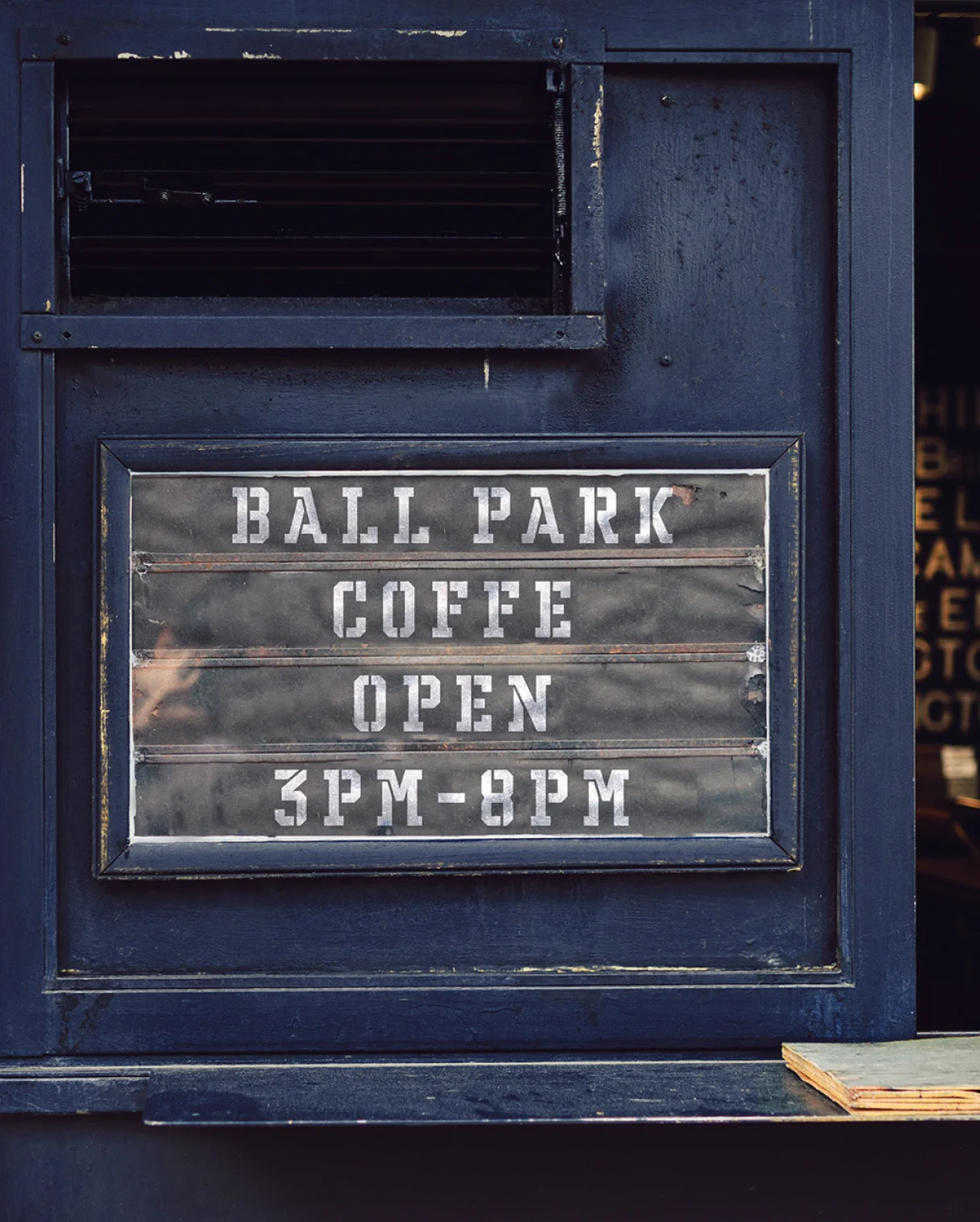
A new facility consisting of a player’s dormitory and indoor/outdoor training grounds build in “Oppama Park” where also Yokosuka Stadium located, with the support of Yokosuka City. We were responsible for the overall direction of the facility, including the concept and signage design. The first thing that caught our attention was the fact that the facilities around the Yokosuka Stadium are located on the city border between Yokosuka and Yokohama, facing the sea. Within historical background, Yokosuka was a shipbuilding town and base town, so this place had two meanings: “facilities for ship building” and “port stop”. This fact inspired us to propose the name “DOCK OF BAYSTARS YOKOSUKA,” a facility named after the “DOCK”. The name was officially named by the mayor of Yokosuka. The name of the facility expresses our hope that the young players of the baseball team will grow up to be top-notch professional baseball players and become famous players. The logotype of the facilities and dormitory, we used the stencils frequently used on the hull of the ship to express the coolness and toughness that reminds this city. The team’s original logo, which is also the origin of players’ dormitory’s name, was similarly arranged in a stencil style. It is a symbol of this facility and has been deployed in various locations. Yokosuka, a port town with good old American atmosphere, has a style that connects with Yokohama, the home of the Bay Stars. Therefore, we developed the official typeface/font “BayStars Suns” from the framework of the BayStars typeface. The typeface/font will be used in a variety of media outlets as a link between the two hometowns and the appeal of baseball in the future.


WHY
To create new pride in the city of Yokosuka.
The Yokohama DeNA BayStars are aiming to make Yokohama Stadium, their home base, a place that the public can feel comfortable and be proud of. The initiative was called “Ballparking Initiative” and has been promoted since 2012. NOSIGNER has been instrumental in making this vision a reality, participating in the “+B” strategy, which aims to transform baseball into a lifestyle, and has attracted many fans to Yokohama Stadium. In fact, the Yokohama Bay Stars have another ballpark in Yokosuka that is a base for their second-team.What is more, Yokosuka City located close to Yokohama, was also an important place that can be said to be another hometown for BayStars. Yokosuka is also a port city like Yokohama and has deep historical ties. The next mission is to tell citizens that this place called Yokosuka is also the hometown of BayStars, creating a phenomenon that people can be more proud of this team.
WILL
A new sanctuary for BayStars fans.
Through the “ballparking concept,” Yokohama DeNA BayStars have succeeded in attracting many new fans. Furthermore, DOCK OF BAYSTARS YOKOSUKA, newly established as a result of this project, functions as a place to support the growth of young players who are the future of this team, and has become a new sacred place for core fans. And we hope that, this facility will become an opportunity for Yokosuka citizens to recognize again that the BayStars are the baseball team of their city, and to be proud of their existence in the future.


INFORMATION
- What
- DOCK OF BAYSTARS YOKOSUKA
- When
- 2019
- Where
- Yokosuka, Japan
- Client
- Scope
- Branding / Branding stationary / Logo / CI Guideline / Font / Naming
CREDIT
- Art Direction
- NOSIGNER (Eisuke Tachikawa)
- Graphic Design
- NOSIGNER (Jin Nagao, Tomoro Hanzawa)
- Space Design
- ON design partners